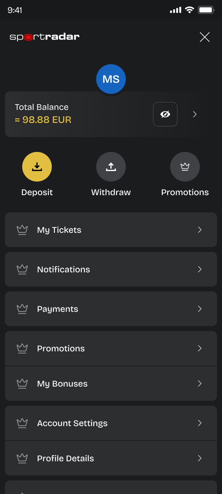
Deposit & withdrawal experience
Designing a flexible payment system for a multi-market iGaming platform.
Context
This project was part of a broader redesign of a multi-market iGaming platform used by players across different regulated markets.
The platform supports deposits and withdrawals across various countries, payment providers, regulatory requirements, and tenant-level configurations.
I was part of the product design team responsible for rethinking the entire Deposit & Withdrawal experience. My role focused on:
- Structuring payment logic across markets
- Designing scalable UX patterns for multiple configurations
- Aligning business, compliance, and technical constraints
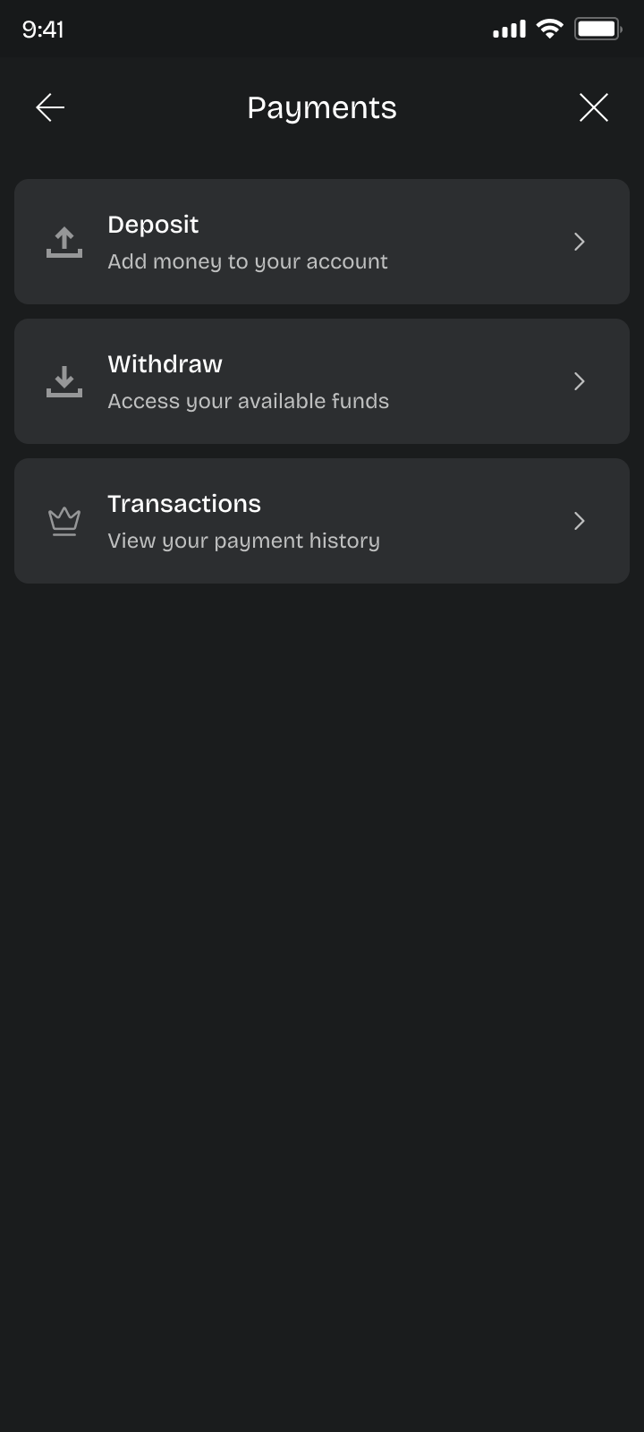
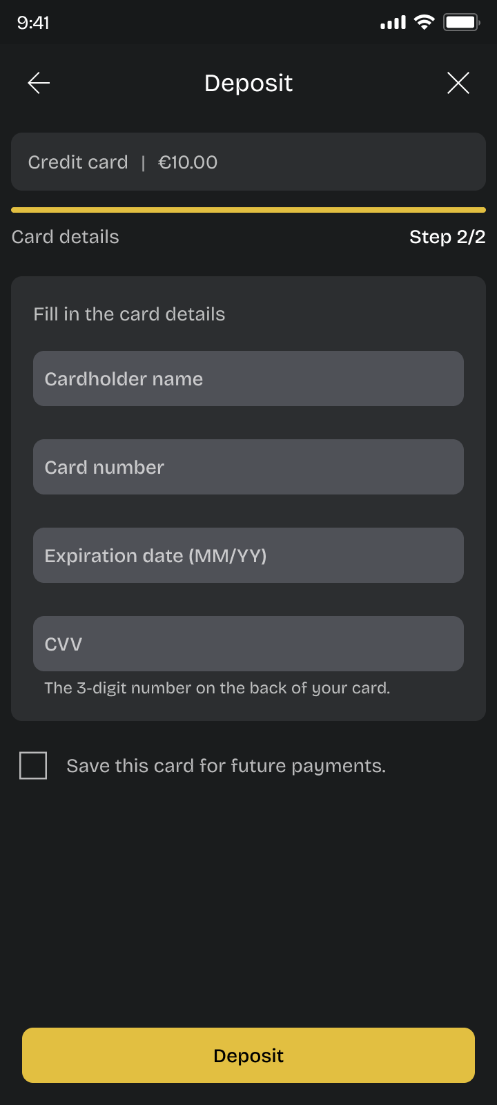
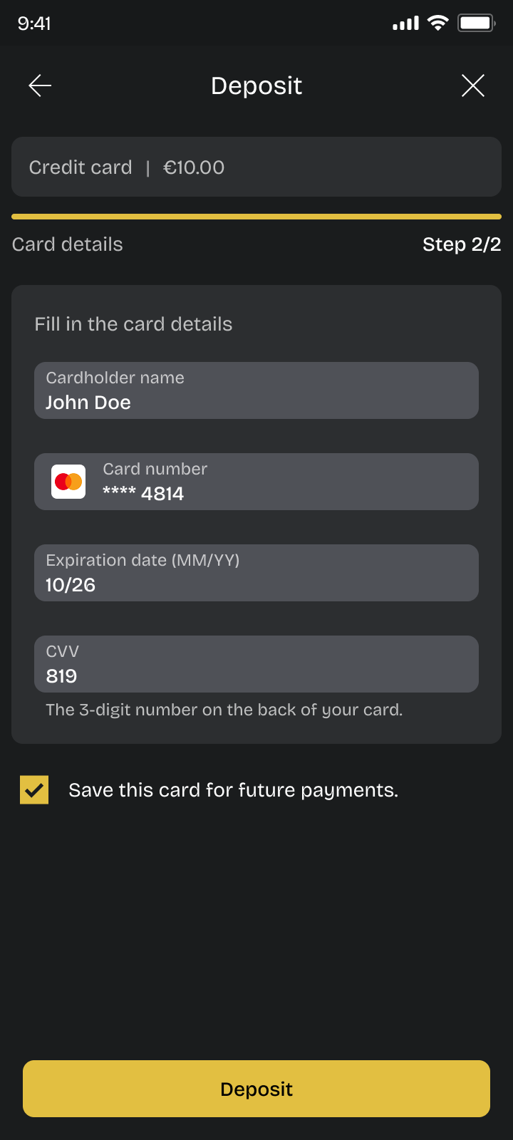
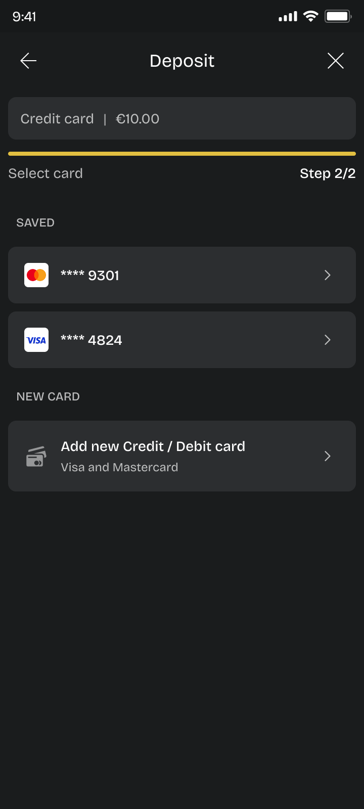
- Creating consistent flows that work across different wallet setups
The goal was not just to redesign forms, but to build a flexible payment system that could scale across tenants while remaining clear and reliable for players.
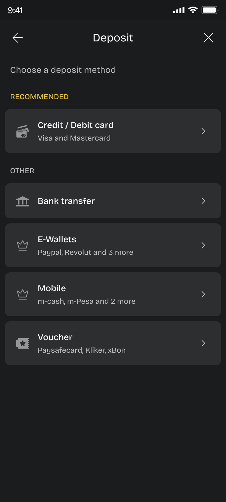
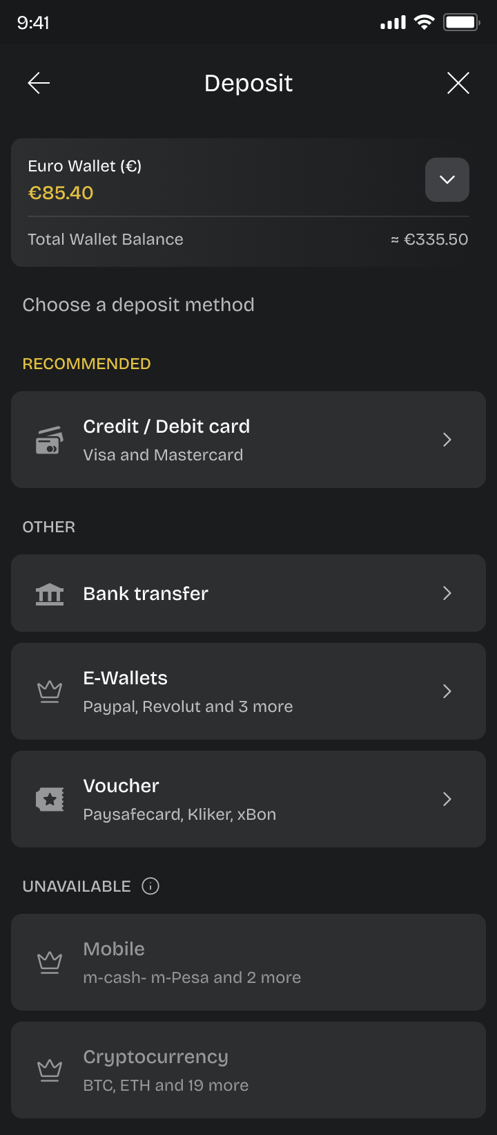
The problem
The complexity was not optional. Different tenants had different setups:
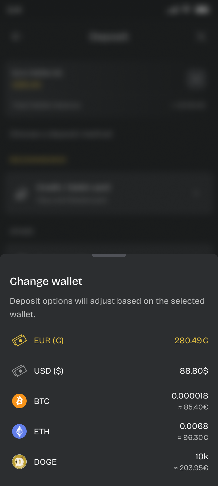
- Some operated with a single wallet
- Others supported multiple wallets
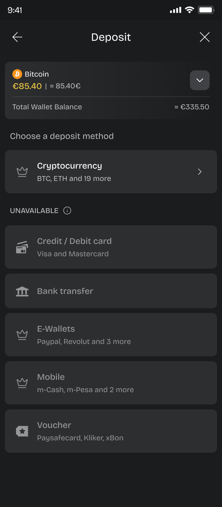
- Payment availability depended on wallet context
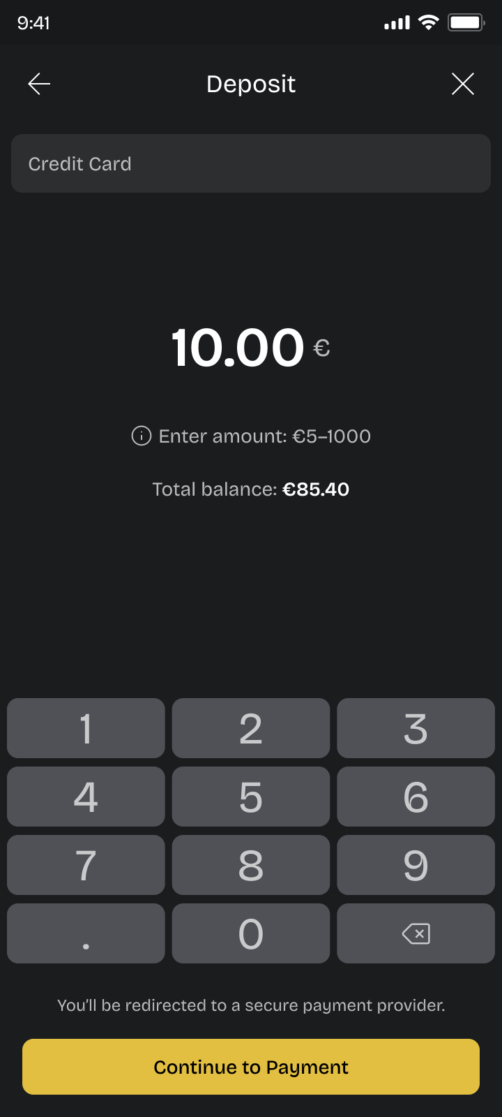
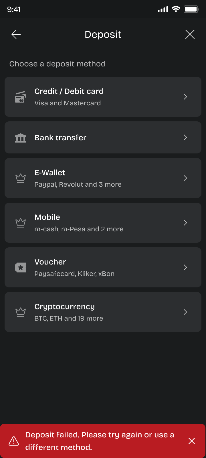
- Some providers required hosted (redirect) flows
- Others collected payment details directly on our platform
Without a clear structure, this led to inconsistent experiences and potential confusion.
The challenge was balancing business flexibility with user clarity.